Thursday, December 17, 2009

Digital Comics

http://www.eatsleepgeek.com/wp-content/uploads/2009/04/action-comics-superman-1.jpg
I thought, for my last blog entry, that I would do it over something that I love. The truth is, I love comic books and they are evolving in this digital age. Marvel is the biggest proponent of this new way to read comics and offers this service in a subscription model. For $60 a year or $10 a month, you can have access to all of their comics that they have put online and they continue to update. Marvel also makes Motion comics. Motion comics literally add motion to comic books and occasionally voice acting. This makes a comic book a step in between a comic and a cartoon. I think this is a very cool way to read/watch your favorite comic books. If you search on Google, you can find many people speculating that this will eventually overtake print comics but I think that collectors and casual readers will always enjoy having a physical copy and I view this as more of something to go along with physical comics than as a way to replace it. The PSP system now offers digital comics on the handheld that you can take with you and read anywhere. I hope that this industry continues to grow and I am very excited to see where it goes.

Digital Explosion

I searched digital explosion on Google and found Digital Explosion, another website design firm. I felt that this company has some pretty interesting designs and has done something that I didn't even know could be done. First off, the intro video was very interesting. It seems to be a good way to introduce people to your website and encourage them to keep looking. I also found it interesting that this company does many different types of design, such as billboards and logos along with websites. I think that this is quite unique, at least in my searches that I have done so far, I don't see as many companies that do print and digital design. I don't know why exactly more companies don't do this, but I'm sure that many of the principles translate from one to the other. The website is a little to busy and could have possibly used some better design, but the work that this company has done is pretty impressive.

digital storm


I searched digital storm on Google and found Digital Storm Online. This website sells computers that are built specifically for gaming and offer a lot of different designs and features. I have always found these computers overpriced, but that doesn't really have anything to do with this post. Anyway, the designs for these computers always seem a little more "intense" than computers that aren't designed for gaming. You can see this from Alienware. also. I'm sure that this design brings up the price a little but that isn't really my concern. I think that this shows that gaming is still not taken seriously by a lot of companies that design things specifically for gaming. Words such as cool, extreme, hardcore, get thrown around and more led lights than necessary are used just to make the thing glow and look "sweet". I think that it is time that these companies take the lead because video games are a huge earner now and outsell movies in gross. I think that it is time to start treating the products and the industry with more respect... but that doesn't mean that I don't want one of these totally rad machines.

Digital Wish

I searched digital wish on oogle and found something that could be very helpful to a lot of people. Digital Wish is a website that allows someone to donate money or technologies to a classroom. Basically, a teacher creates a wish list on the website and people that want to donate register on the website and help the teachers meet their wishes. The site claims to want to update the classroom to the 21st century. This charity seems legitimate, and if it is, I think that this is a very important thing to do for underprivileged schools or children. Children most certainly need to be familiar and able to use digital technology quite well if they want to succeed in the world. Of course, all of these things could be learned later in life, but I believe, at least in my experience, it's easier to grasp onto concepts as a child than it is as an adult. I looked around a little more on digital charities and found a couple that donate laptops, computers, and various different technology to schools and children. This is a very worthwhile idea and I think it deserves more spotlight than it currently gets.

Digital Harassment

http://www.trecasafe.org/Images/abusivetexting.jpg
I searched digital harassment on Google and found something fairly interesting. I found an article from the New York Times that talks about three teenagers that had sent their boyfriends naked pictures of themselves and gotten charged with disseminating child porn. The boyfriends were charged with possessing child porn. This is an interesting story in itself and I've heard about this before, on the news and from friends. I personally think that it is wrong to charge these children with a crime, but I digress. My real point is that I think that this is just one of the many new criminal activities that we face in the digital age. I think the first time that I noticed a new illegal activity on the internet is when Napster became popular. While I was looking around, I even found that people try to sell in game gold or items in games such as World of Warcraft for real life money. As these games become more popular, I would think that shady ordeals such as this will increase. I also think that people enjoy exploiting there technology and making it do anything that it can which can obviously lead to legal ramifications.

Digital Fish

http://www.visitdouglasville.com/Images/geocaching.jpg
Digital fish is what I chose to search on Google and I was able to find out about something that I didn't really know much at all about. Geofish.net is a website that tracks little fishes. These things are planted by participants and locations are uploaded to the website. Then, with the help of a GPS, someone is supposed to go and find this little fish. I think that this really goes along well with our game lectures and assignment. This really reminds me of digital hide and go seek and it's a way to use an existing technology in a way that it probably wasn't intended. I looked up geocaching on Wikipedia and apparently this is much like a 150 year old game called "letterboxing". This game uses uses clues and references to landmarks embedded in stories. I read on the entry that most of the geocaches are of low monetary value and have some sort of personal meaning to the person that is leaving the cache. There are geocaches in every continent and this is a pretty popular activity. I believe that this presents a good ways to get outdoors and still have fun with technology.

Digital Jerk

I searched digital jerk on Google and came up with something unexpected. I found an article from MSNBC that talks about "Gadgets That Make You Look Like a Jerk." I think that it is very interesting that a piece of technology can make you look like a jerk, but then again, I suppose people are judged for what they wear and say constantly, so it isn't that far fetched. The first piece of technology that they mentioned was the Blackberry. This is because some people seem to be addicted to using it and even will use it during conversation. The next was Bluetooth. This is because people wear them constantly and, according to MSNBC, it either makes you look crazy (like you're talking to yourself) or like you think that you are really important because you always have to be talking. The next ones were Tivo, Macbook air and Ipod accessories. The last two were Linux and Segway. Of course this list is meant in a humorous way, but I still think that it has some merit and is something that deserves to be thought about when designing technology.

Digital Popcorn

I searched for digital popcorn on Google and ran across something that sparked my interest. Digital Popcorn is a blog that reviews movies from all different eras. I find this so interesting because it led me to think about how everyone has a place to review whatever they want on the internet. Whether it be comments on a post on a message board or their own personal review website. Personally, my favorite review website is Rotten Tomatoes. This site takes many critics reviews for a movie and combines them into a percentage that represents the consensus of critics across the globe. This isn't just for movies either, Metacritic does these types of reviews for basically all digital media. I believe that this presents a great way for customers to make an informed decision on purchases and to see what the critics thought without reading a bunch of different reviews. These sites seem to be great but I actually found an article stating that Metacritic might be damaging the games industry. Apparently, some companies are becoming so concerned with scores, that they are developing their business strategy around it. I found this very interesting and I had no idea that these seemingly innocent scores meant something very profound for the industry.

Wednesday, December 9, 2009

Digital Kick

http://blogs.discovermagazine.com/cosmicvariance/files/2008/11/time-flies-clock-10-11-2006.gif
I searched digital kick on Google and I found an incredible site. Digitalkick.com is a website that blends old school graphics and sounds with a very competent internet site. I think that this goes to something that we were talking about in class once. Prof. Mannheimer asked us what time is the internet, and I think this goes to show that even a single website can exist in multiple times at once. The site even says when you click to enter, "Enter Our Classical Site". This also made me think of the Wayback Machine that was shown in class. You can look up almost any website and see different points of its existence. This is cool for multiple reasons to me. For one, you can look at websites that no longer exist and I think that it is also fun to look at great looking websites now, and see what they looked like years ago. Internet design has come a long way and I'm sure that it will go even further in the coming years.

Digital Pie


I found an article on Google that questions, "Who gets the biggest piece of the digital pie." This begins by dealing with, specifically, Canadian publishing. I think that this article is fairly interesting and a decent read, but it made me wonder what companies are banking the most off of digital distribution. In 2008, Itunes made $3.34 billion. This is the largest earner in digital distribution of music. Video game digital distribution makes around $1-2 billion. I think that this is a very interesting idea. Instead of having to go through a bunch of channels like someone would have to do years ago, now an artist can get their art distributed on the internet in a much easier fashion. Regardless of the independent artists that get better exposure, now the consumer has more options and convenience than ever. This is very important. There are so many ways that a consumer can now use or purchase media, that designers have a much better chance at having a popular piece of media. Many companies are putting a huge focus and many resources into digital distribution. There is a big debate on the internet regarding whether this is the future or not. I definitely think it is. As broadband penetration goes up and up, people are probably going to want to use the most convenient way to get their media as possible.

Wednesday, December 2, 2009

Digital Party

http://www.shrani.si/f/3L/Ar/2wHJTfZU/studentski-party.gif
I searched digital party and was pretty surprised at what I found. I found an article from Fox Business regarding a tequila company's website. Apparently the El Jimador website began to offer a party planner. This website will help and guide you to make a successful party, of course with their product being used. This is pretty much just a marketing gimmick, but I still think that it is pretty interesting. I believe that the party has been fundamentally changed with the advent of the internet. You can now have access to a larger amount of people to attend and many more options when it comes to theme ideas, snack ideas, games, etc. One might question how this relates to design, but parties are something that is designed and the digital age is making this process much easier. I remember a service called e-vite that would send digital invitations but now this can be done while you are on Facebook or a number of other social networks. You can basically plan a party from start to finish all online, and I believe that this is a huge time saver. You can throw a party and never leave your house. I find it funny that you can host one of the most social things that a person can do and do it all from alone at the desk. If you are ever planning a party, I suggest that you try to do it online. It will probably make your life a whole lot easier.

Digital Carpet

http://www.techpin.com/wp-content/arcstreamav_interactive_floor_1.jpg
Digital Carpet, found by using a Google search, is an extremely interesting technology to me. It's basically an interactive surface that can be walked on. It uses a projection system to project the image on the floor and sensors to detect what the user is doing. The creator said that they are working on ways to upgrade the technology to suit the users needs more than they do now and want to base what the user sees on preferences and the way they use the system. I don't imagine this as something being used in a home, but it would be perfect for advertising. What better way to get a potential customer's attention than to use something like this? I also thought it was interesting that they proposed using this for kids. I think that kids would have a ball with this technology and I could easily imagine this as something that is someday in a school for the children to play with. I think that this is a baby technology at the moment, however, and could definitely use some more improvements but it seems to be heading in the right direction. After searching online for interactive floor, I found that other companies do make similar technologies, but they all seem to be at about the same level of sophistication. I think that the systems definitely need some better sensor equipment to detect the users better and simply some more market saturation. I think that once people start to notice this technology we will be seeing it much more often.

Digital Freedom

http://digitalfreedom.org/banner3.gif
Digital Freedom is a website, which I found from a Google search, that deals with the rights a person should have as a digital creator. The website describes a creator as anyone who relies on digital technology to create or even people who post videos to Youtube or put music on their profile page. The site claims that companies are trying to shut down new technologies that, in themselves, have nothing to do with copyright infringement and can be a good platform for creators to distribute their work. I believe the site, although I didn't see them explicitly say this, is also talking about file sharing programs. These can clearly be used without piracy and can be a good platform to share work. The site also mentions litigation on people who use existing works and make them their own. Song mash-ups would be an example of this. I think that these creators should be protected because these people are making this content their own, and the company with the copyright shouldn't be able to infringe on the project. I have heard of this issue before and I think that it is something that is very important for a digital creator of any sort. I haven't heard or seen on the site any examples of people being prosecuted for this before, but I know that it could someday be a possibility. I think that the "mash-up" culture and other digital artforms are unique and companies should have no say in what creators do if they make something their own work.

Digital Death

http://fantasyartdesign.com/free-wallpapers/imgs/mid/264DeathbyCat5-m.jpg
I suppose I was feeling a little morbid and I searched Digital Death on Google and found this site. The article is titled "How to Prepare for Your Digital Death" and I found it so interesting because it is something that I, and I'm sure many others, have never considered. In this digital age, with all of the status updates and emails, if you were to suddenly die, someone would have to manage notification and managing what you had put online. Even though this is such a strange thing to imagine, I think it pertains to design in quite a literal sense. Many people I know post to many different message boards and create a whole list of different things and put them online. If you were to die, would you want something that you made in five minutes to be left as a legacy to you? I probably wouldn't, but the internet is pretty much permanent or at least more permanent than any other form of media that I know of. The things that you create could possibly never go away. Something that you put on the web 5 years ago can probably still be found. I think that this is a responsibility that every creator should take into consideration. I recommend that people be sure that they are proud of their work before they post it online, because you never know how long it's going to be around.

Digital Water

http://www.expozaragoza2008.es/ContenidosAgenda/digital-water-pavilion-imagen1.jpg
I searched digital water on Google and ran across something interesting again. The Digital Water Pavilion was created by MIT with a couple other companies and can dynamically change and display images and text and take on many different shapes. I find this so interesting because I've never heard of anything like this existing before. When I think of water, I in no way relate it to current technology. The article also says that this can actually be used in an urban environment and can let people interact with this. According to the website, this has many implications for the future of architecture. Here is a link to watch the Pavilion in action. I think that it is very interesting that water can be used as a display or in architecture. However gimmicky this may be now, this could really have a future and I'm excited to see what that might be. I would really like to see this implemented into theme parks at this point but in the future this could serve as an actual option when you are designing a building.

Digital Monkey

http://c2.api.ning.com/files/Xl3n4nptF*oE-RFI0p3ad3kxELbwMRHReLHs9UVTcLXjFRlYeV7JGNVIGCg3boodVfYRRpoqR2s3ar8kVlWnWbXEHeAVDh*0/thumbsupermariobros8bitMario.jpg
I searched digital monkey on Google and ran across the site Digital Monkey Box. This is not really a pretty site and it probably doesn't get much traffic but I love websites such as this. It offers information on video games in the form of a blog like Joystiq or Kotaku and also contains a snarky feel, much like Joystiq and Kotaku. The reason that I chose to talk about this is because a ton of these sites exist and I think that it is a good way for fans to contribute to what they are passionate about. Fan sites have been in existant since the inception of the internet, but I don't think there were many ways to voice your opinion to the whole world on the subject that you were a fan of before the internet. I think that this really speaks to the digital age because this is something that you simply couldn't do before. For example, The Superman Homepage is a modest site but it gets pretty good traffic and I love visiting there. It started off modestly and has grown over the years to be a comprehensive website on anything related to Superman. Websites such as these allow other fans to have a place to talk about what they are passionate about and to interact with fellow fans. I think that this is something very unique to the internet and is something that couldn't exist without it. These sites seem to usually be in blog form and feature news on their subject. I do think, however, that many of these sites are very plain and boring in a design way. It seems like many of the people running these sites only care about the content opposed to the design. Of course, there are exceptions, but this has been my general experience. However, this is a great way to break into the industry that you love, or at least have a place to sound off.

Digital Love

http://www.mmogrindhouse.com/wp-content/uploads/2009/07/flyff00004-2.jpg
After much deliberation, I decided to search digital love on Google and didn't get as strange of results as I originally expected. I immediately found and interesting article that discusses online dating websites from The Washington Post. The article discusses how some people are dissatisfied with sites such as EHarmony because they provide matches for users just by matching people based on surveys that they fill out. This, apparently, leads to people who aren't really that good of a match. The article then goes on to tell about a virtual environment where two people met and are now living together. Being a gamer, I have heard about this, and seen this, a few times. Although this is a site devoted to providing a place for users to flirt it seems like any massively multiplayer online game presents the same options. Here is an article that discusses marriages of people who met on World of Warcraft. I agree with the article that it would be much more desirable to meet someone in a virtual environment, such as a video game, than through some sort of singles website. I think the simulation of seeing a physical being is much more attractive than just a picture and a profile. I think, if it doesn't already exist, that someone should devote an online mmo space for singles. It should be a respectable place that users can meet and chat and find out more about each other. I really wish I was in this business right now, because I think that could make someone a lot of money.

Digital Frog

dissectionThis is just one of those things where I really can't believe that it even exists and it never entered my mind. I searched digital frog on Google and found Digital Frog International which specializes in digital frog dissection. I suppose, if I would have put some thought into it wouldn't shock me that a program existed to digitally dissect a frog, but I never thought of it as a business. According to their website, their company did start by a simple program that they developed to digitally dissect frogs and has grown into a company that supplies many different types of educational software. When you look at the screen shots of the services, it is most certainly not a Halo game but, according to this website, this software has been very profitable and was at least profitable enough to start a whole company and to have been in business for almost 15 years now. I think that this is so impressive because it seems like such a strange way to start a company, but I suppose that if you have a good idea that anything can happen. I think that this also speaks very well to something like the Iphone App store. The reason I say this, is because unique software such as this has a much wider audience. Someone can create something in their basement and build a whole company around it. This is very encouraging to me and I'm sure that it is to everyone who wants to get involved with software development.

Digital Spike

http://aranezmedia.com/wp-content/uploads/2009/05/web-design-main.jpg
I searched digital spike on Google and came up with what seems to be a pretty interesting web design company. Digital Spike has a pretty impressive website and, I think, represents the company quite well. They have a portfolio of what they've done and contact information so you can pay them to start working immediately. No matter how much I like this site, It seems like a ton of sites like this exist with people offering to do the same exact thing. You can look up web design companies and find a huge list. I looked up web design companies on Google and clicked on a few different links and noticed that all of these sites, the ones that I saw at least, have great websites and claim that they can do anything for you. I think that the market has definitely been over saturated but there are still a lot of great design firms. After looking through this list of the "best" design firms you can really see that the industry is focused on flashy graphics and simplicity. I think that this has been the trend for a while and will probably continue for the foreseeable future. I'm also seeing a lot of movement, which I think is a relatively new thing to web design. A few years ago, I thought it was "awesome" when something on a web page would actually react to something I did. Now, it is to be expected from the bigger websites. Anyway, I definitely recommend looking through the top ten list and see how you react to them.

Monday, November 30, 2009

Digital Cup

http://static.guim.co.uk/sys-images/Guardian/Pix/pictures/2008/02/12/china-internet460.jpg
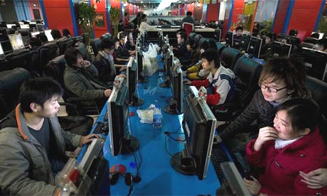
I searched digital cup on Google and I think that I came up with something fairly interesting. The Digital Cup is a gaming/coffee/internet cafe located in Wasilla, Alaska. I sometimes forget these places even exist and I think that this is very unique to the digital age. I would liken it to the arcades of yesteryear. Anyway, I'm sure this place is great and they'll do anything from sell you a coffee to help you design your gaming PC but I would rather look at internet cafes in general. I really don't see many of them around, except for the one I know of in Danville, Indiana. I couldn't find any exact numbers, but a Google search of internet cafes proove that there are quite a few around and they must make money or so many wouldn't exist. I think that the idea of an internet cafe has now become as outdated as a VCR. My phone can do internet as I walk around campus and I'm sure in the next few years that technology will be a lot cheaper. Who will need an internet cafe when the person can do everything that they need from a device that they already carry around with them. One might argue that people who can't afford a computer that have to use one can go visit these places but I even think that this number is dwindling faster and faster. A study from 2008 said that internet penetration had reached 82% and I really doubt that this number would ever fall. This doesn't leave the cafe much of a market, especially while more and more people sign up to an ISP. Basically, I believe that the internet cafes are antiquated and I don't think they will last that much longer.

Digital Squirrel

http://www.iaacblog.com/anniegoyal/wp-content/uploads/2007/10/kunsthaus.jpg
I searched digital squirrel on Google on a whim and actually came across a pretty interesting design firm. Digital Squirrel, which is located in Ohio, specializes in digital architecture. They use high end rendering software, at least they claim it is, to create designs for customers. They also do theme parks and do work in theater. I found this interesting because I have never heard much about digital architecture. It seems when I see an architect on TV that they are always doing everything by hand which just doesn't make much since in the digital age. After looking at digital architecture on Wikipedia, it seems that it really has some clear benefits over traditional architecture. A digital architect doesn't have to worry as much about complex computations because the computer will do them for you. I think that a digital architect is the wave of the future. Of course there will probably always be traditional architects, but I think the benefit of saving time and money and not necessarily cutting down on quality really make digital architecture stand out.

Thursday, November 26, 2009

Digital Grass

http://muonics.net/site_assets/41/img/em-side-tree.jpg
Once again, I randomly put grass after the word digital and came up with something pretty interesting. Digital Grass was an interactive installation in the UK to celebrate architecture week. It's basically an installation that used motion tracking and cameras to track people passing by the screen to manipulate the grass. This is all very interesting but the company that put all of this together, HMC Interactive, is a company that creates interactive multimedia for clients. I think that this is a very interesting idea. This could certainly be much better than a thirty second TV spot and a lot more creative as well. After viewing pieces that they have worked on and searching interactive media on Google, there are countless examples of art. This, I believe, could potentially reinvent, if it hasn't already, the way that people view art exhibits. This offers the user to interact with the piece instead of just staring from a distance. I also think that it would be a good way to get children interested or more interested in art. It seems like, at least to me, that with our digital culture, static paintings and sculptures sometimes seem a little boring. Some of these pieces are very interesting and I hope to view some of them in person.

Digital Sculpture

http://www.trinity3d.com/images/gnomon/digital_sculpting_human/example1.jpg
I began by searching digital sculpture on Google. One of the first results I received was this video. Although I already knew that computers were used to create characters, I didn't know that these programs, at least the one that he shows, were so easily manipulative. I always imagined making characters like the one he makes to be next to impossible, but these programs seem a lot more user friendly than I once imagined. I'm sure that many people are already familiar with these types of programs, but I have only seen them in action a few times and never seen them shown off in this fashion. It really boggles the mind to think that technology has made sculpting so much easier. You can edit your piece so much easier and redo any mistakes with a simple control z. These programs, such as Mudbox, Zbrush, and Modo have been used by the movie industry to make all kinds of different characters. I really never payed much attention to the programs that were used to create these effects, but pretty much anyone can get them and begin experimenting.

Digital Window

Looking Glass 1
After searching digital window on Google, I think that I've found one of the coolest things I have seen in a while. Although this is just a concept, this digital window could offer us so much. If someone were to carry this technology, which is once again just a concept, it could offer us so much information on our general surroundings. I imagine being able to point this device at a restaurant and immediately get reviews. Of course it all seems a little sci-fi right now, but the website says that this design does have a little feasibility attached. It contains things such as GPS, internet, camera and scanner. Even though this might be way more elegant than any technology that could actually be made, something like this is most certainly possible. Although just a concept piece, I think that this could be improved by actually adding more to the face of this object. With only one button and all of these features, this piece doesn't feel practical to me. This might seem pretty nitpicky, but I still love the design of this concept piece.

Digital Palace

http://ecx.images-amazon.com/images/I/511Cwllm71L._SL500_AA280_.jpg
I searched digital palace randomly, which led to this website. This is a website for China's Palace Museum. It is a very competent website that shows off the museum and allows users to plan visits and look at many of the pieces that the museum contains. I found this so interesting because this palace has been around for many many centuries and has an internet site devoted to it. The internet is something that seems so current yet it can contain things from all of time. This leads to something Professor Manheimmer asked in class, "What time is it on the internet?" Why of course there is no solid answer for this question, I would like to think that the internet is all time at once. For example, I can look at a map of Europe from 100 AD while listening to a podcast that just came out. This is interesting to me because, even though this could be said about a library maybe, nothing else offers people this experience. We are able to connect and look at any point in history or speculate about the future.

Wednesday, November 18, 2009

digital weapon

The search for digital weapon wielded a result that I found pretty unexpected. I found an article from The Guardian that discusses the effect of the internet on feedback and complaints. The article also relates complaints and feedback from a radio show with the Obama campaign. This is a very interesting idea. The internet provides users to voice their feedback immediately and most certainly has more exposure than just yelling into the air. Of course, this has been around for years now at this point but it seems like Obama was really the first to properly utilize the internet in his campaign. Anyway, right now pretty much anyone who has an internet connection sound off their opinion and, in this case, cause some pretty large ramifications. I think that it is good that more people nowadays can have their voices heard but it is so easy for these things to get out of control. For example, this is a much more common way that this instant access can affect someone. In this case, people using Twitter started a rumor that began to catch on and eventually became so popular that people began to believe that it could be true. This happens on Twitter much more often with false reports of a celebrities death for example. I think that this is one of the more ugly parts of the internet. In a realtively short amount of time, news can spread that is totally eroneous and not many people can tell fact from fiction. This article from MSNBC spreads even more light on this phenomenon. Even though this blog looped around and evolved into something else, I think it made me realize that the instant services of Twitter and Facebook can't be trusted no matter how factual and proffessional they might sound. An Austrailian newspaper confirmed Jeff Goldblum's death when he was, in fact, very much alive. I think that the activists on the internet that are actually getting things changed is great but there are still so many people that don't realize the impact that their words can have. I think that everyone should really double check what they post on the internet because you never know what is going to become the newest trend.

Digital Table

http://www.fahad.com/pics/microsoft_surface.jpg
I began this entry by searching digital table on Google. My results mostly included tables that have a touch screen built in. These tables can do almost anything. A fairly popular example of this technology is called Microsoft Surface (pictured above). These tables feature multi-touch technology and allow you to manipulate images and surf the web, all using touch. Another feature that they describe is transferring information, such as pictures, from portable devices and the transfer shows up in real time. This is a fairly interesting idea in my mind, but the units are in no way practical for current personal use. The basic unit costs $12,500 and the developer unit costs $15,000. Price aside, I think that this is a fairly revolutionary idea. I believe that this technology has the potential of changing the way people use computers. This would move the computer from the desk to a possible communal experience in the living room. To me, surface represents the first step of a bigger process. Another company doing something interesting with touch surfaces is called Touch Taste Tech. This company as incorporated the technology into bars and clubs to let customers order their drinks. Audi has also created an app that lets you customize your car in real time. I couldn't find any real sales numbers for these products but I haven't noticed them in any public places yet. I think that this needs to be improved by simply finding ways to lower the price. If this technology becomes more ubiquitous I think that it will naturally bring down the price. I imagine this technology thriving in a consumer setting. If someone could walk into a restaurant and place their order just by manipulating images and/or pressing on a screen, it could make the experience much more interesting. It might cut back on human interaction, but it might also make the experience much more convenient. Ordering a drink from a bartender is easy already, but it might be more fun to use an intuitive interface instead.

Digital Car


I started out by searching digital car on Google with no prior knowledge to what this could mean. According to How Stuff Works, digital cars were represented in TV in such shows as "My Mother the Car" and "Knight Rider". Once the computer age began, cars began sporting features such as a 40gb hard drive in the 2008 Cadillac CTS. What makes a car digital is intelligence, according to the article. The digital cars of today concern themselves with mostly safety and entertainment. As for safety, these new cars can "sense" the traffic that's ahead or behind the car and many other features that the article explores. These cars also feature GPS, which almost seems to have become ubiquitous in new cars over the last couple of years. As for entertainment, automakers are looking into adding wi-fi to cars that can actually keep up with highway speeds. Storing music on your car hard drive and hooking up your Ipod already exists now. Where will this technology take us? I think that it will lead us to the self-driving car. As you can see, this technology already exists and it would seem that it would inevitably be incorporated for consumer models. I think that this would allow the entertainment factor in cars to increase. If the cars are almost exclusively driving themselves, who is to say that you can't watch video or at the very least text and drive. I firmly believe that this is the future of automobiles and I can't wait.

Digital Wallet


This time I tried the phrase digital wallet randomly. Only after I searched I realize that this is something that's been around for a while now, however, I did not know anything about it's origin. According to Wikipedia, the digital wallet was first utilized in the late 90's with the advent of storing "e-cash" online. Apparently these services never caught on and the idea of the digital wallet or e-wallet evolved over the years to provide internet users with a convenient way to store and use online shopping information. I am fairly confident that this is the same general idea (or is exactly the same) as services such as PayPal. I honestly think that the digital wallet revolutionized the internet and I really don't think that anyone could disagree with that. However, I think that there is still a lot there that could be improved upon. I still don't feel as if people feel comfortable sharing their banking information online. I believe that something more has to be done to assure the customer that they are safe and that everything will go smoothly. Also, these services are very easy to replicate and someone with basic computer knowledge could put something on their website to steal your information. In the future, I think that this industry will continue to grow and online shopping will become even bigger than it is now. Ebay and Amazon seem to be two of the biggest players and I'm sure we will see more companies in the coming years provide the same services. I believe for these companies to be as successful as possible, they need better options for online payment.

Wednesday, November 11, 2009

Digital Pencil

This time, I tried my luck searching digital pencil. I actually found something pretty interesting. I found the textbook "The Digital Pencil: One-to-One Computing for Children". The purpose of this book is to take a serious look at children having their own computers and analyze what the costs might be, what devices they might use, etc. This book is dealing with the idea that every child should have a networked computer of their own for school. After searching a little on Google, it seems that many schools have started using this one-to-one computing model although the evidence of improved grades have been thin according to Education Week. http://www.edweek.org/ew/events/chats/2009/08/06/index.html, Education Week, also offers a live chat answering many questions about the realities of one-to-one computing. I didn't really know much about this, but after reading, I think that this is a very important step in education. It seems like it has to be done, and the sooner the better. For example, at IUPUI I'm on a computer constantly and I think that a curriculum built to show children how to effectively use computers would pay off immensely over the course of their entire lives.

Tuesday, November 10, 2009

digital beverage


Once again, I did a random search, this time for digital beverage. The first thing that I noticed was a digital beverage dispenser and mixer. This device has a very minimalist and sleek design and manages to mix alcoholic and non-alcoholic beverages. It also connects to the internet and can be updated with new mixes. These are pretty helpful and a neat little gadget to have around the house. I think that this raises the question, however, of is digital technology becoming to pervasive. One has to ask themselves if we really need a digital drink mixer. The honest answer is what could it hurt. After scouring around the internet, almost every appliance around has some sort of microchip or digital display at the least. This item also couldn't really exist without digital technology. Nothing ever allowed you to press a button and mix a drink while having limitless drinks available to be made. I find it very interesting that this smart appliance exists. http://www.lge.com/about/rnd/digital_appliance.jsp, LG's website, explains that they have a very strong commitment to digital appliances. Some of their concerns are clearly outlined as more functional than stylistic, but I believe that if LG is taking this seriously so are all of the other manufacturer's. This leads me to believe that we will be seeing many more things like this in the future, and I welcome it.

Digital Clothes


I searched digital clothes randomly on Google and actually got an interesting result. I imagined that I would get something relating to clothes that you can buy on a digital avatar but this shows that real-life clothing is even getting a digital upgrade. According to, http://computer.howstuffworks.com/computer-clothing.html, computer clothing is seriously being looked into and Levi is even marketing a "musical jacket" in Europe. The website also reports that this technology has also been looked into for medical purposes such as to monitor heart rate in patients. I think that this is a very interesting concept, but it really does seem in the development phase right now. I don't think that it is at all ready for a main stream release. I think that it is also a little bit too gimmicky for now. Possibly when the tech gets better, so will the product, but I honestly don't see a use right now. What I would like to see from this product, and I have no idea if this is possible, is a shirt that could change color or design completely. It seems like this could one day be possible.

Wednesday, October 28, 2009

Digital Penguin

Immediately when I heard the phrase digital penguins, I thought of the movie Surfs Up. This was basically a movie where a bunch of penguins competed in a surfing competition. Now, I expected to relate this to CG characters in some way, but I quickly found that digital penguin could mean the publishing company Penguin. http://garysmailes.typepad.com/gary_smailes/2008/04/digital-penguin.html was a blog post that was titled, “Digital Penguins and History E-books”. This post begins by simply stating that Penguin is going to start selling e-books (as of April 2008) and pricing them the same as old print books. Books have a wide range of prices, but one has to assume that the digital form of a book would be a much cheaper production. Cnet published an article, http://news.cnet.com/8301-13556_3-10250017-61.html, that says why ebooks aren’t cheaper. They say that many of the costs producing a physical copy are still there in a digital format. Most ebooks happen to be $9.99 and Cnet concluded that this is probably near the ground floor. Ebooks at the very least could be easier to produce but the price isn’t really all that ridiculous. Maybe I’ll buy an ebook now. ..

Digital Candy

Digital candy is a very strange concept, but as I was looking around on Google I found a company that offers digital candy digital scrapbooking. http://www.heritagemakers.com/ is the website. I really don’t know much about scrapbooking, but I find it interesting that they are marketing themselves as “digital candy”. Wikipedia describes scrapbooking as, “Scrapbooking is a method for preserving personal and family history in the form of photographs, printed media, and memorabilia contained in decorated albums, or scrapbooks. The idea of keeping printed materials of personal interest probably dates to shortly after the invention of printing. This trend is probably similar for photographs”. I found this interesting because scrapbooking seems like a very monotonous and time consuming activity and I would never relate this to images of candy and enjoyment. Anyway, the website offers plenty of templates with various designs to complete your personal scrapbook. It seems to be a pay website where you work digitally on a scrapbook and can share and work on your own scrapbooks. This clearly makes it easier for you to design and share, which is something that I remember from family visits. It seems like every time I would visit my grandmother that she would have something new in a photo album to show everyone. The digital environment makes sharing and possibly even designing much easier. I always thought of scrapbooking as a very analog experience but apparently this is no longer the only option.

Monday, October 19, 2009

Nintendo Entertainment System

https://blogger.googleusercontent.com/img/b/R29vZ2xl/AVvXsEjuMk300ptfaXoMsuFAXZyUQZBukQOcxg9c3Yn62ypfLp_TeW_PPYf-uIHJOLw5hoMcmsmmBlRArlHGk0wRvr-3-kzvVNWtdZ1HefCDoRE5ocdCGMUi-k3uhMckej1KeF7Eaen-5X-FvEc/s400/nes-console.jpg
I thought, that with all of the new "high-tech" systems that are available today, that it would be nice to take a look into the past. The design of the current consoles (Xbox 360, PS3, and Wii) are made to look sleek and futuristic. When looking back on old consoles it's very easy to think that they were never thought to look that way. However, the NES stood apart from it's competitors in its design and its dominace over the market for almost a decade. Anyway, getting to the design aspects, this just looks like a tri-color rectangle. I don't think that this is necessarily bad. It's very simple and allows people of all ages to be able to recognize that all is needed is to insert the cartridge and press the power button. Compared to other consoles of the time (Atari 5200, Sega Master System, etc) this was a fairly good looking machine. Those systems were much bigger and ,in my opinion, harder to operate. As with my previous post, this design denotes simplicity. The controllers only have an "A" and "B" button for gameplay which implies, although incorrectly in many cases, that the games are simple. The D-pad was standard, as the joystick was going out of fashion and start and select are fairly standard components on any console. I think this is why Nintendo was able to garner such a wide age-range in their fan base. The simplicity is inviting to someone of any age. My two year old nephew has even fiddled around with this controller with varying degrees of success. Now, controllers and systems aren't nearly as inviting, with possible exception to the Wii. You really have to have played generations of consoles to thoroughly understand how to work a current system. This is unfortuante and could be corrected easily if we took a look into our gaming past and try to ressurect some of the good ideas present at that time.

Iphone design


About a year ago, I bought the coveted Iphone. I think the main reason that I bought it was because of the unique and simplistic design. However, I only knew that I liked it and I thought it looked cool. I want to know why I thought it looked cool.
First off, I immediately notice how thin the device is. This is for practical reasons, fitting in the pocket, but it also helps quite a bit stylistically. It's very easy for anyone to wrap their hands around and simply feels good to hold. The casing is also very attractive. It curves at the back of the device slightly that, when sitting, almost seems to be floating. This speaks to the overall slim factor in the design. I think that the people at Apple wanted to make it almost seem weightless. The button layout on the phone is ingenious in my opinion. with only a few dedicated buttons on the device, it makes it really simple and quick to turn up and down the volume, go back to the home screen, or put the device on hold. There really can't be any confusion with what the buttons do after 15-30 minutes of using the device. The solid black or white finish also speaks to its simplicity and ease of use. These two colors go with about anything so it never feels like it's out of place. Finally, the touch screen and screen in general are the most important part of this device. The phone seems to be dedicated to the screen, giving up all the room it can to it. Of course, functionality wise, this is very important for navigation but it also seems very progressive. This phone sets itself apart from older devices by having such a large screen. Everyone remembers the old Nokia phones that had a tiny screen. I think that this, even now, makes the phone feel futuristic. I don't think that this core design will change anytime soon, as it is so successful. There really doesn't seem to be much that warrants change either.

Wednesday, October 14, 2009

Computer Design

Everybody knows what a computer looks like. As a college student, I have to use on nearly every day. Wouldn't it be nice if everybody had something a little more attractive than just a big rectangle?
http://www.wikinomics.com/blog/uploads/dell_desktop-300x279.jpg
This is the first interesting design that I found. This is from Dell and the purpose of the product is to save space and obviously look cool. It's called the Dell Studio Hybrid, and although a review from CNET says that it isn't really that practical and a laptop would be a better choice, I still think that this is a very cool and unique design. It reminds me like the evolution of the Mac mini. I also like the idea that you can fit a whole computer into a package that small. If I would have designed it, I would have tried to figure out something else to do with the disk drive. I think that it stands out a little too much, but I don't know what the other options would be. The color scheme is decent enough and has a professional feel and the lit up Dell logo compliments the system well.
http://www.creativepro.com/files/story_images/20080509SAWG_fg19.jpg
This is a computer done in a steampunk style. This really seems to have a classic feel and looks like it could have existed years and years ago. The keyboard is my favorite part. Apparently it was designed by using old typewriter keys placed onto a keyboard. It's not necessarily very practical and it doesn't change the function of the machine, but it's a really nice conversation piece at least. I think that it is so striking because you could imagine this current piece of technology in Victorian times. The color scheme is fairly simple but looks classic. The flower design on the monitor also reminds me of old sculptures or pottery. If I were design this, assuming I could, there isn't anything that I would change with this.

Wednesday, October 7, 2009

Bus stop design

http://farm2.static.flickr.com/1413/1429422388_f2ccdb76ed_o.jpg
Okay, so this really caught my interest. Apparently, this is a bus stop in Ventura, California. Everybody knows what a bus stop normally looks like, and this definitely doesn't look like a bus stop. It really reminds me of a surreal painting of a building or even the landscape after an earthquake, which California has many of. I haven't read much on the design or designer so I will just speculate and try to figure out why these choices were made. The front most design explicitly resembles some sort of buulding and seems to be coming out of the ground. I think that this choice could have been made to play with the feeling that people get, well at least I get, when waiting on a bus that seems to be taking forever. It almost feels like you are living there. However, once you get on the bus you no longer are "living" there which distorts the view of the stop as a home or place to stay which could be reasoning for the strange arching shape. The middle arch seems much more traditional compared to the house but is still out of place for a bus stop. It could be there simply to protect people from rainfall but it has three distinct arches in the metal work which remind me of a very Roman design. Red, at least in my mind, can be associated with Rome. Of course I am again speculating, but this choice could have been made because of the communal experiences that rome shared such as bath houses and buses are extremely communal. The final 1/3 of an arch in the background looks simply like windows. I think that these were placed in the back to represent looking into the past. When you are at a bus stop it seems like time is almost standing still and you have time to reflect on the past. Finally, these things all seem to be connected in a spiral shape which I believe is just to show that all of this can be experienced at an average busstop. I don't know if I'm even close to being right, but this is still a very interesting design.

Vodka Design

To start this out, I'm not condoning drinking but I found some really interesting designs of Vodka bottles of all things. Vodka can range from cheap to expensive so I'm pretty sure that all of these bottle designs are from high end products. Well, let's get on with the booze.

http://colt-rane.com/wp-content/uploads/acres01dailyicon.jpg
First up is something called Blaze Vodka. I couldn't find out much about the company or the vodka, but I'm sure that it's the best vodka ever according to them. Anyway, this is obviously a very unique design. Much like the other vodkas on this entry, these are meant for high class sophisticated drinkers. The design on the far left reminds me most of an hour glass. I think that this could be to instill the sense of a timeless product. It's going for a classic vibe probably. After looking at the middle design, I was instantly reminded of a vase. I think that this could be high class simply because vases can be very expensive and intricate. As for the design on the far right, I think that the hole through the bottle denotes a since of uniqueness and craftsmanship. This works very well to show off a rich image.

http://www.ravensbarrow.com/wp-content/uploads/2008/10/Crystal%20Head%20Vodka.png
Up next is Crystal Head Vodka. It relates to the legend of the crystal skulls that have supposedly been found throughout the world. I think it's also trying to be a little "bad ass" with it's design because a skull seams very manly to me. Also this looks, and is for that matter, expensive because of the intricate design. This is one of those bottles that it really doesn't matter what's on the inside. I think that this could sell with nothing in it.
http://www.thelifeofluxury.com/images/double_cross_vodka.jpg
This is a vodka out of Slovakia called Double Cross. It's a very interesting and simplistic design that really brings out the products "elegance". It reminds me most of a Zippo. Zippo's don't necessarily denote elegance but they are expensive and classic in design. The logo also uses simplicity.
http://popsop.ru/wp-content/uploads/oval-vodka_swarovsky.jpg
This vodka is clearly more explicit in trying to persuade the buyer that this is expensive and ellegant. I think that this is the worst designed bottle of the ones I have shown because it is so obvious. The other designs, except for the skull maybe, used simplicity in there design which really reminded me of something expensive. This design seems very tacky and outdated.
Well, to sum it up, my favorite design was the Double Cross. I thought that it's simplicity beat out all of the more busy designs. I was very surprised that vodka companies tried so hard to design interesting bottles, seemingly just another way to say that, "hey, I'm expensive."

Thursday, October 1, 2009

"Fun" Designs - 10/1/09

So, to preface this, I simply looked up fun designs on a Google image search. This is how I think I'm starting to get my best results. Anyway, let's get this going.
This first image is one of two sticker designs that are described as "fun". They use bright and vivid colors and are extremely positive. I'm sure that these are used to encourage good grades on tests, but how in the world is a star happy? Who even came up with the gold star system? Well the last one I can't answer, but I feel like attempting to answer the first even though I can't find any reason from Google as to why these mark achievement. Anyway, I suppose gold stars have been used in the military for a long time. Maybe it's because they are so "high" up that they mark a high achievement. It's strange that we also use the phrase movie stars. Maybe because stars are seemingly unreachable, so they are used for high achievement. Well, that satisfies me for now, maybe I will go back into this later. Back to the design, these seem to be aimed towards children. It seems like they both have a bright and simple background with a blocky type to keep it simple. Next.Here are some designs on watches aimed at teenagers, once again deemed to be fun. I'm beginning to notice that to be fun, you have to have bright and vivid colors. It seems that stripes are also very prevelant in "fun" designs. For me, these designs make me feel a little torn. On one hand, I can see the fun in bright colors mixed with other bright colors, but it's so vibrant that it's distracting. Perhaps a reason that these are deemed as fun is because they are noticed and thus can be a conversation starter with other kids. The contrast between the colors is drastic which might say that you don't take yourself to seriously and that you like to have fun. I still don't feel like I have a very good grasp on how a design is deemed fun, so let's try one more image.


Finally, this is simply a "fun" pattern that was added to a bedspread. It's of brightly colored flowers and a sun. I think I finally am starting to understand this. Fun is a very innocent idea and throughout looking through my search results I noticed countless of innocent designs. These are very simplistic, bright, and happy, at least I think, to catch a child's interest. These designs also work for adults because they grew up with designs like this so it reminds them of more innocent times and probably brings back some happy memories. Anyway, I think I gained a little understanding on why "fun" is associated with bright and cartoony designs.

Interesting Chairs - 10/1/09

Chair and furniture design are huge industries. For something so simple as a chair, there are so many varying designs. Some seem purely designed for artistic reasons while some seam designed with only comfort in mind. Here is something that caught my eye. This is called the glide chair. According to the website where I found the picture, this lacquered aluminum and fiberglass chair molds to your body. I find this to be a very striking and fairly practical design, even with being so minimalistic. Immediately when I looked at this it invoked a feeling of nature and peace. The first thing that came to mind was the shape of a bird. If you look at it the way I do, the top of the chair curves just like a birds body and the legs are clearly on the bottom. This chair is also supposedly very relaxing so it would seem to make sense that they would look at nature, which many view as peaceful and serene, for a design.


As I was speaking about earlier, I some chairs cater to more artistic tastes than practicality and I think that this one is leaning towards the artsy side. Although it could be an extremely comfortable chair, it doesn't evoke a very comfortable feeling to me. It also doesn't seem to have a very relaxing design. With all of the curves and the dominant red color it feels very wild. The first thing that this chair reminded me was of Gene Simmon's tongue. That might sound weird, but doesn't this remind you of Kiss? At least for me, my initial reaction was wild and unpractical. To be fair, I'm fairly sure that this chair is only a concept, but it still deserves to be judged and time and effort went into the design.

This chair is definitely more explicit in it's design, but it struck me as so interesting that I just had to add it. This reminds me most, as I'm sure it does you, of a tank tread. This chair denotes a since of struggle and battle which is what it looks like it would feel like to sit in it. Although it isn't very practical, I think that it could look good in a game room or just out on display.

Finally, I chose this chair simply because it really caught my eye. For me, this is the perfect blend of art and practicality. When I first looked at it, I really couldn't relate it to anything, but after further thought it started to remind me of a snake. This may seem like a stretch but if you start at the end of the seat and work back words, a snake like image seems to become apparent, at least for me. I don't think that this is necessarily a bad thing either. Although snakes are scary for a lot of people, they are also extremely flexible and maneuverable with ease. For whatever reason, that seems to scream comfortable. Anyway, that's all for chair designs and I'm surprised that they could be this interesting.

Wednesday, September 30, 2009

Back to the Future- 9/30/09


To open, the Back to the Future movies are some of my favorite movies I've seen. That being said, the most iconic thing from that movie is the DeLorean. Of course they chose it because it was a current and sleek car at the time, but they made it all their own with some fairly simple design changes for the movie. Before I get to deep into it, here is the original car.
This car at the time, and now to a certain extent, still feels pretty futuristic. The gull wing doors are very unique and the stainless steel body is very sleek. However, this basic design definitely didn't look much like a time machine. I think that the biggest and most important design choice was the big exhaust wedges on the back of the car. This makes the car look like it's pushing out a lot of energy and makes it feel more powerful. They also changed the back window area of the car and added some sort of huge engine looking thing, once again, making the car feel so much more powerful than the original design. And of course, they added all of the wires that light up on the side of the car. Once you go inside you get the iconic flux capacitor, which is what makes time travel possible, and the interface that tells Doc and Marty where and when they are traveling to and from. I think that this was a very imaginative design for a time machine. I can't think of any improvements because it works as a homemade time machine. It feels like something that could actually be built by a mad scientist with enough money. If you started changing non-essential things like color and tires, etc, it would lose a lot of it's homemade charm. Anyway, I have always liked this design and felt that I should weigh in on it.

Mouse Design- 9/30/09

We use a computer mouse constantly this day in age. When I started thinking about this, I realized that the overall design of the mouse hasn't changed that much since its inception. This is a very early mouse used by Douglas Englebart in "The Mother of all Demos" where he showed off many new technologies on a personal computer such as word processing, video conferencing, hypertext and various other things. Anyway, this is the mouse.
Now sure, this does look a lot different than the mice that we use today, but all of the basics were there and this was shown in the 60's. But in the 80's we had the standard two-button mouse and that has remained intact ever since then. The mouse I use today is a logitech wireless mouse. This is it.
I'm not saying that the design and the ergonomic aspects haven't evolved over the years, but the basic blocky shape with buttons are still there. The overall navigation aspects haven't changed that much with moving a cursor on a screen by moving the mouse. I think it's one of those, "if it isn't broke, don't fix it," type of deals, but the basic design has remained the same for forty years. I think it's time to evolve to touch screens, but if we have to stick to mice, I found a couple of cool examples on the web. Although these aren't very practical, they are certainly imaginative and change up the standard mouse quite a bit. Here they are.Clearly the designs still have the functionality of a mouse but instead of being just an average mouse, they are also a handgrenade and a spaceship. I'm actually quite surprised that this idea hasn't caught on more. It seems that companies have been very profitable selling computer acessories so why hasn't this taken off? Well, I can't really answer that question but I do like to think that things that I see everyday and would consider their designs as boring, or at least have become boring over time, can be spiced up this easily.

Wednesday, September 9, 2009

Logo Evolution-9/9/09

So, I started thinking about logos as I was drinking a Coke. I realized how simple the logo was. All it is is Coca-Cola written in cursive. So, to relate it to the blog, I began to look at various logos online until I stumbled upon the evolution of the Shell logo.
I think that this relates perfectly to assignment two. They are changing the logo with minimal effort to improve it. To preface this, I am not really going to dive into the history of the company, but simply discuss the logo with my point-of-view. That being said, the logo began very simply. It's really only a front view of what's obviously a seashell. Things get interesting with the next design, where the standard Shell logo begins to take shape. In 1904, the logo became a top down view of the shell. It is still much more intricate than the current shell design. It looks to almost be a photograph. The next version loses a little intricacy but also adds some more inking, which seems to replace some of the former lines. The logo doesn't change again until 1930, where it begins to look much more a design than a literal drawing of a shell. The edges are much more rounded and the border is a heavy black line. In 1948, color, according to this picture, is added as well as the name of the company to the logo. Once again, the logo seems to gradually become more streamlined. The border has become more intricate but the edges have once again become more rounded. In 1955 they updated it with much less lines and changed the title to red. This change isn't all that drastic, but it does keep streamlining the design. In 1961, the logo only added a red background to the design. Not much to say about that one. Now, in 1971, the logo takes shape to what we know today. There is now only seven lines and a thick red border, still with the yellow interior. This logo has remained basically the same until now. In 1995 they changed the color a little and in 1999 they removed the text, but that's really all.
The point of this description is to show that Shell has seemed to treat their logo as the way we treated assignment two. Sure the changes early on where pretty drastic, but when their brand became widely known and popular they couldn't afford to change anything too much or they would lose recognition.

The Death of Superman Design- 9/9/09

To begin, I love reading comics and Superman is my all-time favorite hero. As I was growing up and becoming aware of comic books, The Death of Superman event was just getting underway. This is certainly my favorite cover from this series, and I would like to analyze and critique it.
First, I love this cover because of the simplicity of it. Superman's iconic cape, beaten and tattered and blowing in the wind. Even without the text, anyone picking up this book knows that something very serious is wrong with Superman. There are some, presumably rocks, keeping up the stick that is holding the cape. We can see some people mourning Superman's death in the background while the left and right border are framed by some high rise buildings. I also notice what seems to be Lois Lane and a few others mourning in the background. However, what I find most interesting about the cover is the sunset in the background. It seems to contrast the bleak and ominous cape flapping in the wind. It also has a very painterly quality to it which I believe contrasts the realistic cape and buildings very well. The color choices are bright in the foreground and get extremely dark near the buildings. Once again, this contrasts the sunset which has purples, blues and yellows. I'm pretty sure that the sunset also represents the sun setting on Superman's career. Of course, I'm assuming this but I think it is a fair assumption.
Although I do love this cover, I do believe that it could be improved in a few simple ways. First off, I see no reason why the text is really needed. I know that it was for sales, but I don't think anyone that was aware of what was happening in the comics didn't know what this issue was going to contain. I also don't care for the way my eye follows the title, to the cape, to the text at the bottom. I think that the cape could be moved a little left or right and maybe tilted at a bit of a steeper angle. This may sound drastic, but I would maybe even remove the buildings and just make it the cape with the sunset behind it. I do like the color choices and am pretty sure that I would keep them basically the same.
That being said, this is one of my favorite covers in comics and I think that it served its purpose perfectly back in its time. But looking back on it, I do believe that it could have been slightly improved.