First up is something called Blaze Vodka. I couldn't find out much about the company or the vodka, but I'm sure that it's the best vodka ever according to them. Anyway, this is obviously a very unique design. Much like the other vodkas on this entry, these are meant for high class sophisticated drinkers. The design on the far left reminds me most of an hour glass. I think that this could be to instill the sense of a timeless product. It's going for a classic vibe probably. After looking at the middle design, I was instantly reminded of a vase. I think that this could be high class simply because vases can be very expensive and intricate. As for the design on the far right, I think that the hole through the bottle denotes a since of uniqueness and craftsmanship. This works very well to show off a rich image.

Up next is Crystal Head Vodka. It relates to the legend of the crystal skulls that have supposedly been found throughout the world. I think it's also trying to be a little "bad ass" with it's design because a skull seams very manly to me. Also this looks, and is for that matter, expensive because of the intricate design. This is one of those bottles that it really doesn't matter what's on the inside. I think that this could sell with nothing in it.

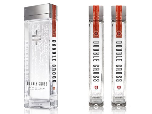
This is a vodka out of Slovakia called Double Cross. It's a very interesting and simplistic design that really brings out the products "elegance". It reminds me most of a Zippo. Zippo's don't necessarily denote elegance but they are expensive and classic in design. The logo also uses simplicity.

This vodka is clearly more explicit in trying to persuade the buyer that this is expensive and ellegant. I think that this is the worst designed bottle of the ones I have shown because it is so obvious. The other designs, except for the skull maybe, used simplicity in there design which really reminded me of something expensive. This design seems very tacky and outdated.
Well, to sum it up, my favorite design was the Double Cross. I thought that it's simplicity beat out all of the more busy designs. I was very surprised that vodka companies tried so hard to design interesting bottles, seemingly just another way to say that, "hey, I'm expensive."
No comments:
Post a Comment